

 Subscribe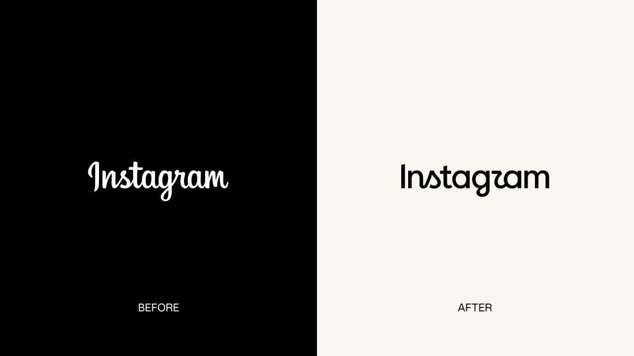
 The company has not indicated whether the redesign will be accompanied by changes to its app icon.
Instagram has refreshed its wordmark for the first time in a decade, replacing the cursive lettering it has used since 2016 with a redesigned typeface.
Instagram head Adam Mosseri announced the change on Instagram and Threads on 13 August, describing the new wordmark as “sharper and more modern” while retaining references to the original design and its simplicity.
The redesign affects only the text-based Instagram wordmark. The platform's familiar pink-and-orange gradient camera icon remains unchanged. The previous major visual overhaul in 2016 saw Instagram replace its skeuomorphic brown camera icon with the colourful gradient design still used today.
The social media platform has also rolled out a digital film to highlight this development.
The new lettering retains the recognisable script influence but introduces redrawn letterforms, creating a hybrid between cursive and print. The change has already drawn mixed reactions online, with some users praising the cleaner look while others have questioned its legibility.
The update comes after Instagram's wordmark remained largely unchanged for around 10 years.
The company has not indicated whether the redesign will be accompanied by changes to its app icon.
The refreshed Instagram wordmark is now rolling out globally, with the full brand identity following through 2026 and beyond.
May Hartono, director - brand design, Meta, said, “The refreshed brand system puts our community’s creativity and self-expression front and center. It’s designed to spark courageous action and give people the confidence to create and show up as themselves, freely and fully."
Jasmine Probst, director - product design, Instagram, added, “Script reflects individuality, so referencing that felt right. The new wordmark is bolder and simpler, with touches of unexpectedness. It cues individual expression, a personal voice, both of which have always been core to Instagram."