Nat Habit, a beauty and wellness brand rooted in Ayurveda, has announced a rebrand with the launch of its new identity and philosophy, 'Breathe Life'.
The transformation reflects the brand’s evolution from a natural skincare pioneer to a modern beauty movement that blends nature, science, and purpose.
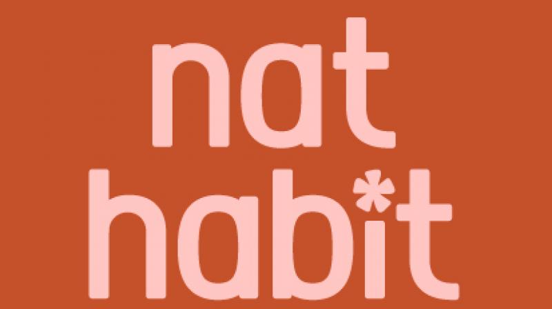
As part of the refresh, Nat Habit has introduced a new logo, visual language, and packaging system anchored in the promise: “We don’t just make beauty more natural. We breathe life into your beauty.”
The updated design reflects a shift in both aesthetic and intent, presenting a stronger, bolder articulation of natural beauty.
At the heart of 'Breathe Life' lies a clear philosophy that beauty that is nurturing yet potent, rooted in ritual, and powered by science. The new chakra-inspired flower logo replaces the previous calendar icon to symbolise harmony, vitality, and balance. A grounded typeface lends authority and calm, while the vivid new colour palette led by a striking orange breaks from the category’s typical green-brown tones, adding energy and warmth. Supporting hues like Hibiscus Pink, Tikta Green, and Ubtan Yellow draw emotional links to the brand’s core ingredients and benefits.
Nat Habit’s 'Breathe Life' identity will roll out across digital platforms, packaging, retail, and quick commerce starting this month, supported by a multi-touchpoint campaign featuring creators and immersive consumer experiences.
Swagatika Das, CEO and co-founder, Nat Habit, said, “With Breathe Life, we are marking a confident evolution for Nat Habit from Fresh Ayurveda to a bolder, more purposeful expression of natural beauty. Our customers have always felt that Nat Habit is more than a beauty brand; it is a way of living rooted in wellbeing, vitality, and authenticity. This new identity brings that spirit to life, expressing the strength and confidence of modern Ayurveda while staying 100% natural at its core. Breathe Life reflects our belief that true beauty is about feeling alive, balanced, and deeply nurtured."
Das added, “Sahher isn’t just a familiar face; she perfectly embodies the spirit of Breathe Life and everything Nat Habit stands for. She represents the harmony of tradition and modernity, blending clarity with confidence, and grace with purpose. Her personal philosophy of beauty mirrors ours, making her the perfect face to usher in this new chapter. Through this collaboration, we aim to build deeper emotional resonance and connect with a wider community seeking beauty that feels both modern and meaningful.”


