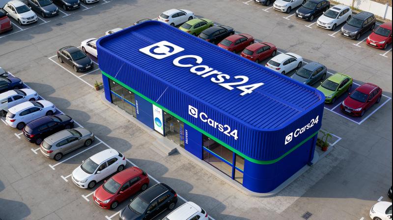
Ahead of its IPO, Cars24 has unveiled a refreshed brand identity, moving from CARS24 to Cars24, shifting from an assertive, all-caps style to sentence case.
This marks an important moment in the company’s journey as it grows from a transaction platform into a long-term car ownership ecosystem.
According to the company, the change reflects maturity and confidence, a brand that no longer needs to announce itself loudly, but instead shows up consistently and responsibly.
At the centre of the new identity is an open circular logo, intentionally designed to represent continuity rather than completion. The circle reflects how car ownership actually works in real life, cars change hands, needs evolve and value continues across different phases, Cars24 stated. The open form signals flexibility and movement, rather than closure.
Alongside the logo, Cars24 has also updated its brand colour. The familiar blue has been replaced with what the team calls a ‘younger blue’ - brighter, clearer and more alive. The new blue reflects how it wants to show up for customers today: present, attentive and human, the company stated. It carries the belief that trust does not need to feel distant to be credible and that scale does not have to come at the cost of warmth.
Vikram Chopra, founder and CEO, Cars24, said, “When we started, being loud helped. But as the company and the team grew up, the work started speaking for itself. This change is about reflecting who we are today, calmer, more human and focused on earning trust over time.”
The updated identity was developed over more than 1,200 hours of design and iteration, focusing on simplicity, longevity and adaptability, according to the company, and is intended to remain relevant as it enters its next phase of growth.


