Birla Tyres has announced the launch of its new brand identity, including a modernised logo and a redesigned corporate website, reflecting the company’s renewed direction under its new promoters — a consortium led by Himadri Speciality Chemical and Dalmia Refractories.
The rebranding is part of a broader effort to reposition Birla Tyres as a high-performance, future-ready brand in the Indian and global markets.
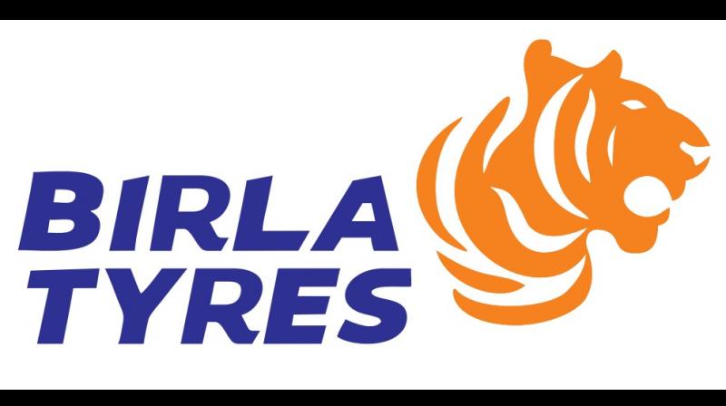
The brand’s new logo features a custom-designed wordmark symbolising speed and forward motion, paired with a striking tiger mnemonic—Tyger—that embodies power, agility, and leadership. With its vivid Blue and Orange palette, the logo stands for a vibrant expression of trust, optimism, and the brand’s unwavering drive to lead. Together, these elements signal Birla Tyres' renewed ambition and its commitment to winning in a rapidly evolving mobility landscape, according to the company.
A company spokesperson said, “This rebranding is more than merely a visual transformation; it is a reaffirmation of our dedication to purposeful development and progress. Our new logo encapsulates the essence of Birla Tyres, which is founded on three fundamental pillars: a legacy that motivates boldness, a product line that is prepared for the future, and an unwavering commitment to continuous innovation. As this new identity signals Birla Tyres' readiness to meet the evolving needs of the automotive industry with energy, innovation, and purpose.”
The company is set to roll out integrated marketing campaigns across digital, television, print, and outdoor platforms in the coming months, aimed at strengthening brand recall and connecting with both new-age and legacy customers.


